Retro Photo Effect Purely with CSS3
Posted on Jun 29, 2013
After playing around with some cool new CSS3 features I managed to create a good decent
looking retro style image effect using just CSS. With the help of CSS filters and gradients, let's
take a look at how a cool vintage photo effect can be created directly in the browser.
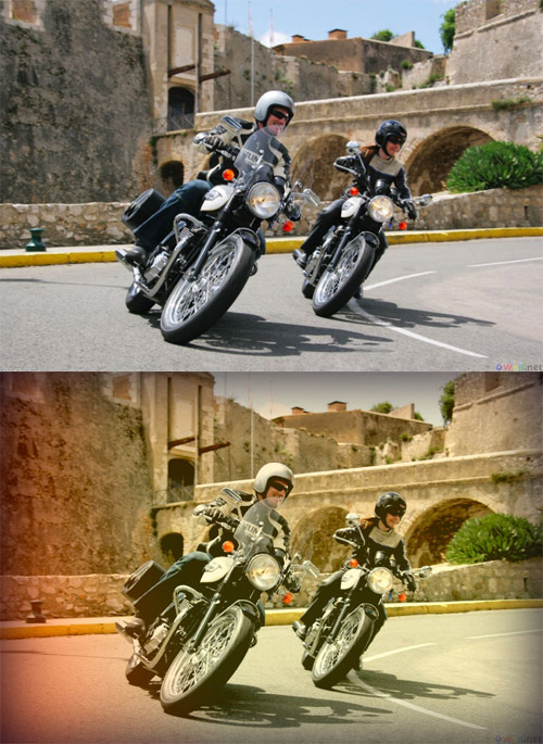
This Good Technique uses a mix of CSS filters and CSS gradients to combine various colour overlays to create that typical old school analogue photo effect. Currently CSS filters only work in Webkit browsers (Safari, Chrome).
In order to create a retro photo effect, we first need a photo. Add an image to a HTML file as you usually would. Some of the CSS effects rely on a block element container, so the image will have to be within a <p> or <div>.
In the CSS add the above code to instantly create a cool retro effect on any image. Seeing as CSS filters currently only work in Webkit browsers, the other vendor prefixes have been omitted to keep the example clean and tidy. Don't forget to add standard and -moz- variants of each CSS rule if you want to future-proof your work.
This Good Technique uses a mix of CSS filters and CSS gradients to combine various colour overlays to create that typical old school analogue photo effect. Currently CSS filters only work in Webkit browsers (Safari, Chrome).
How to create a Retro CSS3 Photo Effect
<div class="retro">
<img src="images/retro_me.jpg" alt="My retro is great!" />
</div>
In order to create a retro photo effect, we first need a photo. Add an image to a HTML file as you usually would. Some of the CSS effects rely on a block element container, so the image will have to be within a <p> or <div>.
.retro {
display: table;
-webkit-box-shadow:  inset 0px 0px 100px rgba(0,0,21,1);
background: -webkit-linear-gradient(top, rgba(255,146,0,0.2) 0%,
rgba(255,230,48,0.2) 62%),
-webkit-linear-gradient(20deg, rgba(255,0,0,0.5) 0%, rgba(255,0,0,0) 37%);
}

.retro img {
position: relative; z-index: -1;
-webkit-filter: sepia(20%) brightness(10%) contrast(130%);
}
In the CSS add the above code to instantly create a cool retro effect on any image. Seeing as CSS filters currently only work in Webkit browsers, the other vendor prefixes have been omitted to keep the example clean and tidy. Don't forget to add standard and -moz- variants of each CSS rule if you want to future-proof your work.
Leave a comment: