CSS: Responsive Navigation Menu for Beginners
Posted on Apr 4, 2014
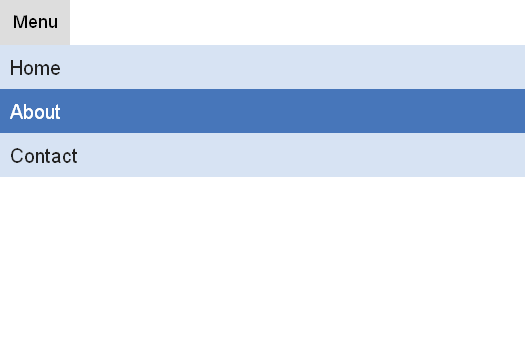
This very easy jQuery-based Responsive Navigation Menu.
HTML and jQuery code
<html>
<head>
	<title>Responsive Navigation Menu for Beginners</title>
	<link rel="stylesheet" href="index.css" />
</head>
<body>
<ul id="navigation">
	<li><a href="#">Home</a></li>
	<li><a href="#">About</a></li>
	<li><a href="#">Contact</a></li>
</ul>
<script src="http://ajax.googleapis.com/ajax/libs/jquery/1.8.2/jquery.min.js"></script>
<script type="text/javascript">
	$("#navigation").addClass("set").before('<div id="menu">Menu</div>');
	$("#menu").click(function(){
		$("#navigation").toggle();
	});
	$(window).resize(function(){
		if(window.innerWidth > 700) {
			$("#navigation").removeAttr("style");
		}
	});
</script>
</body>
</html>
CSS
* {
	margin: 0;
	padding: 0;
	font-family:Arial;
}
ul {
	width:100%;
}
li {
	list-style-type: none;
	width:33%;
	float:left;
	border-right: 2px solid #fff;
}
li:last-child {
	border-right:none;
}
li a {
	display: block;
	background:#d7e3f3;
	padding:10px;
	font-size:20px;
	text-decoration: none;
	color:#232323;
	transition: all 0.25s linear;
}
li a:hover {
	color:#fff;
	background:#4776ba;
}

@media screen and (max-width: 700px) {
	#menu {
		width:70px;
		height:35px;
		display: block;
		background:#ddd;
		font-size:18px;
		text-align: center;
		padding-top:10px;
	}
	#menu:hover {
		background:#ed770e;
		cursor:pointer;
		color:#fff;
	}
	#navigation.set {
		display: none;
	}
	ul {
		width:100%;
	}
	li {
		width:100%;
		border-right:none;
	}
}

@media screen and (min-width: 700px) {
	#menu {
		display: none;
	}
}
Leave a comment: